THE POWDER ROOM REVEAL - BEFORE AND AFTER
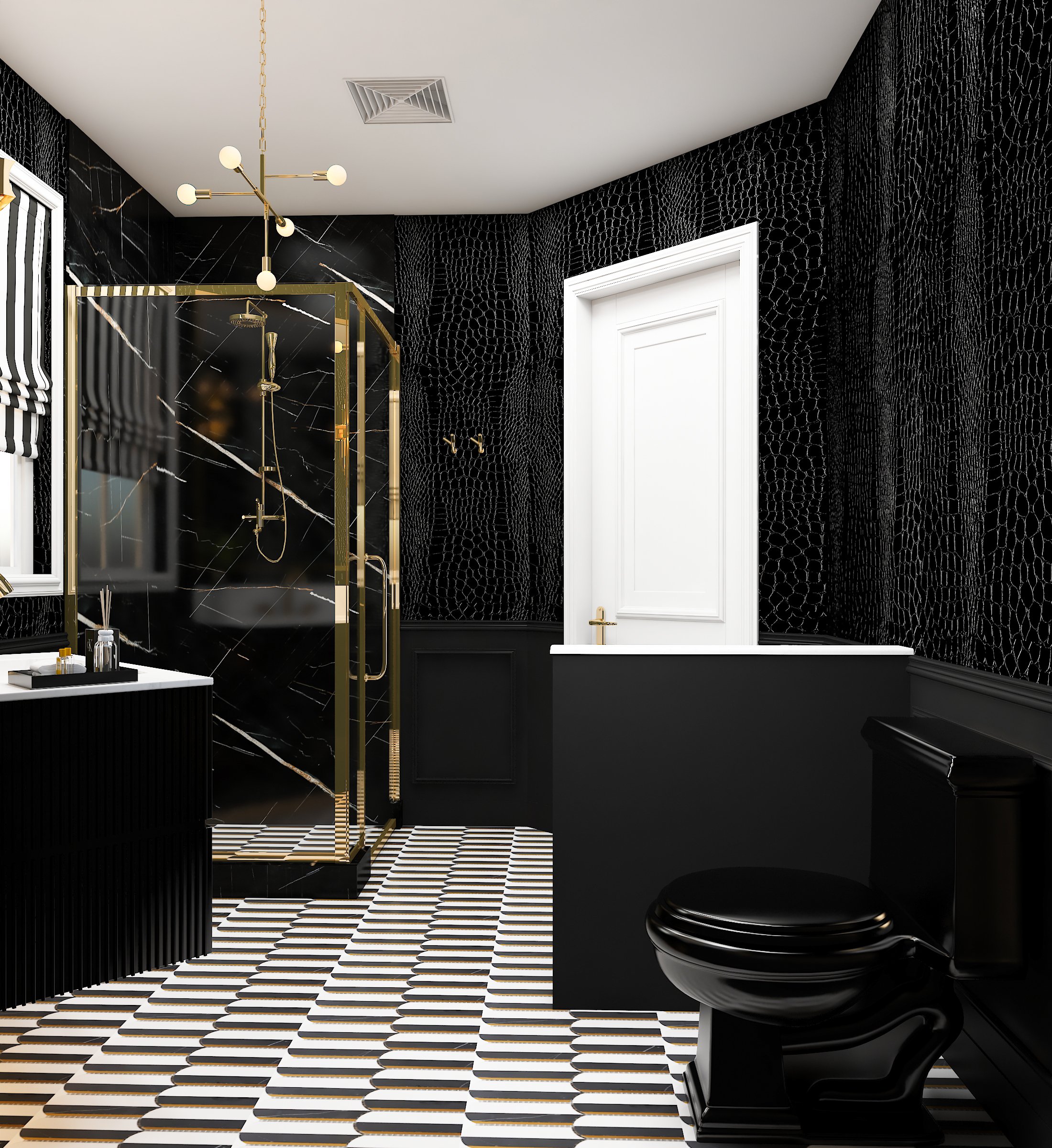
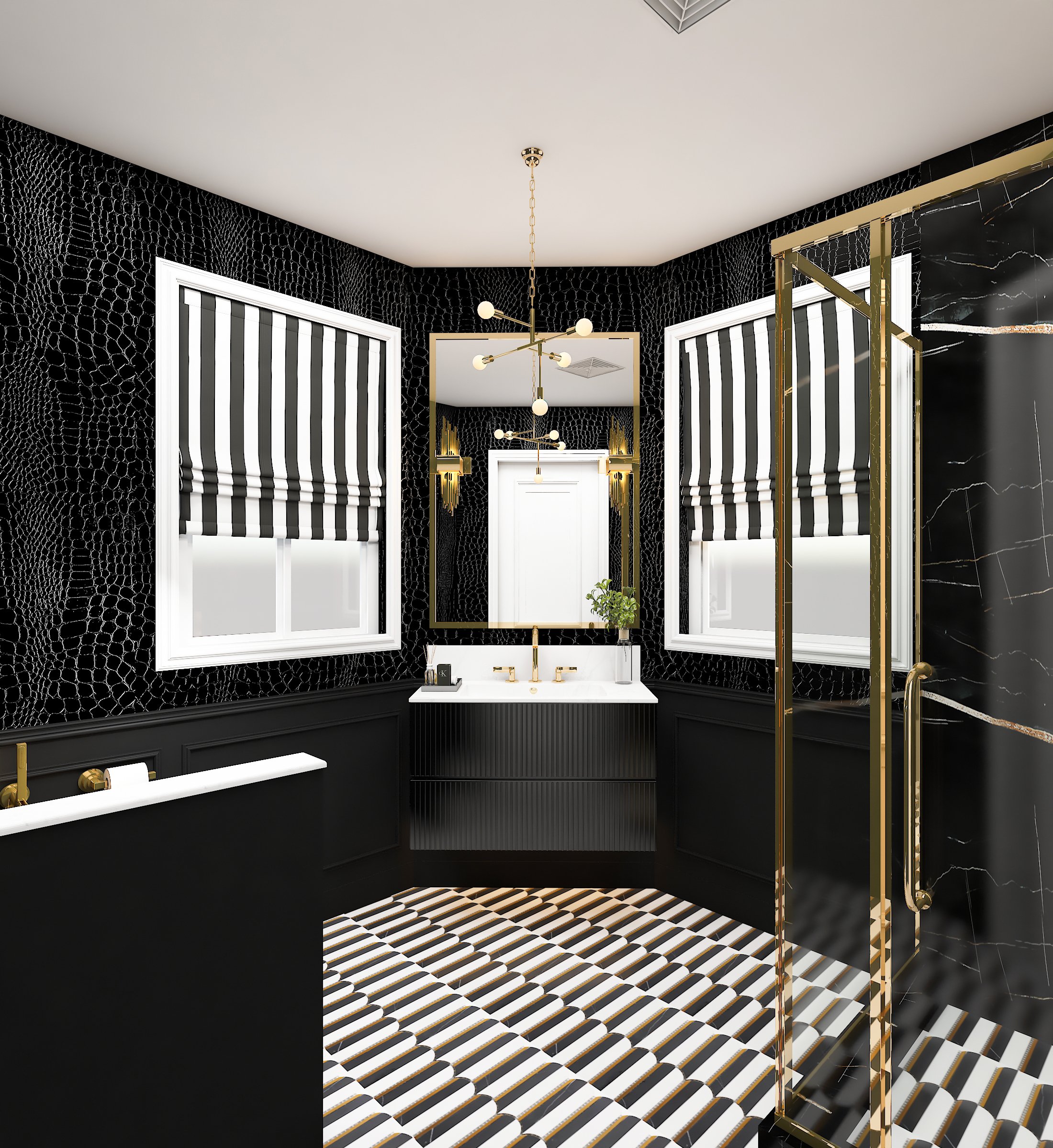
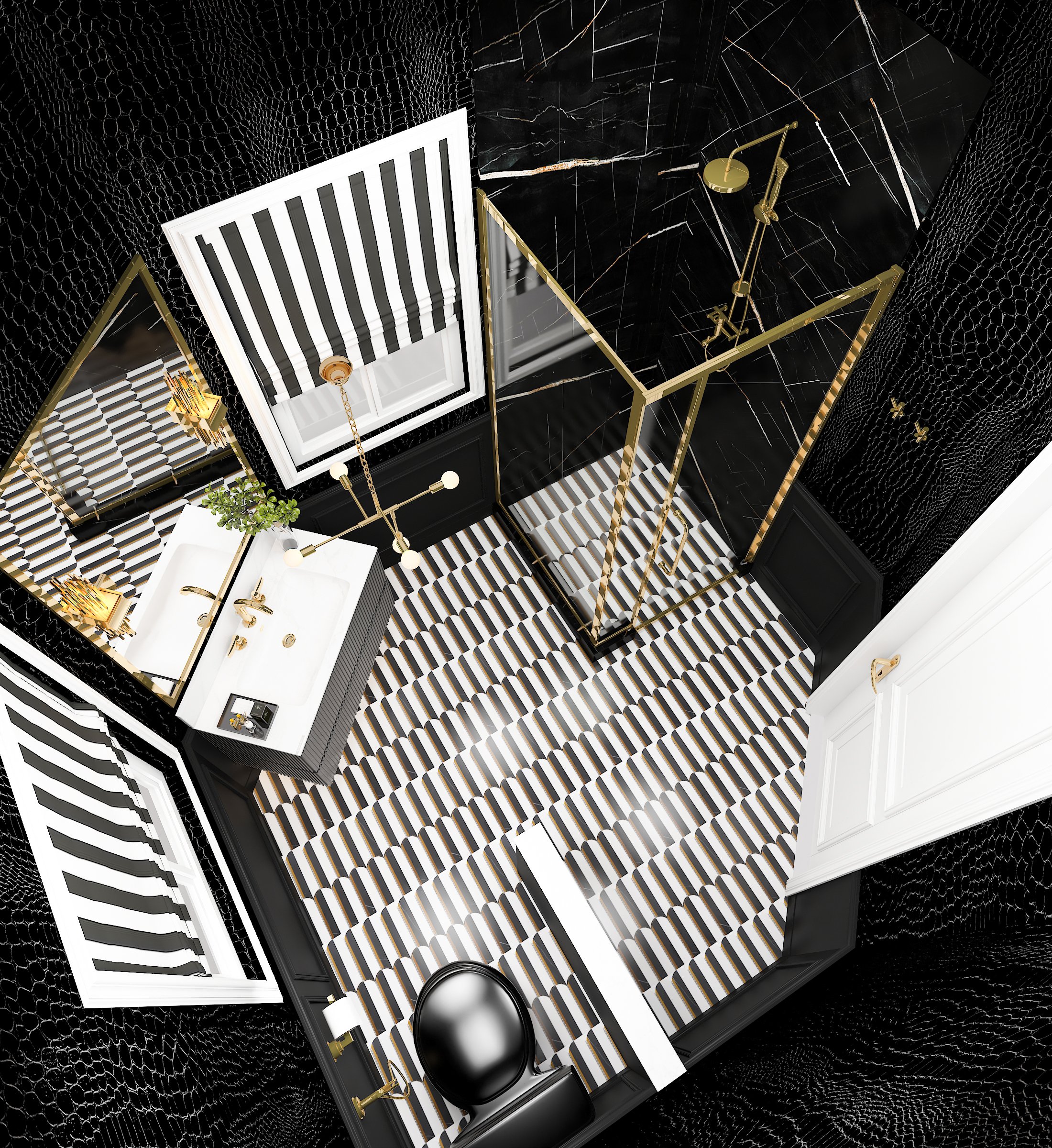
I know it’s taken me a minute to get this blog post up, but I wanted to make sure to provide you with as much information, links and resources as I could to get your next project up and running! What you see above are the incredible renderings from the ARETE team of the bathroom concept we came up with. Just a few little tweaks later and you will see the entire reveal by scrolling down!
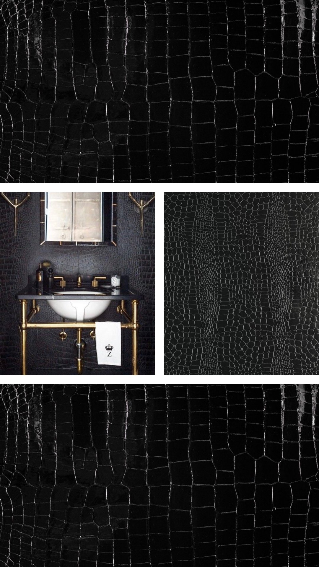
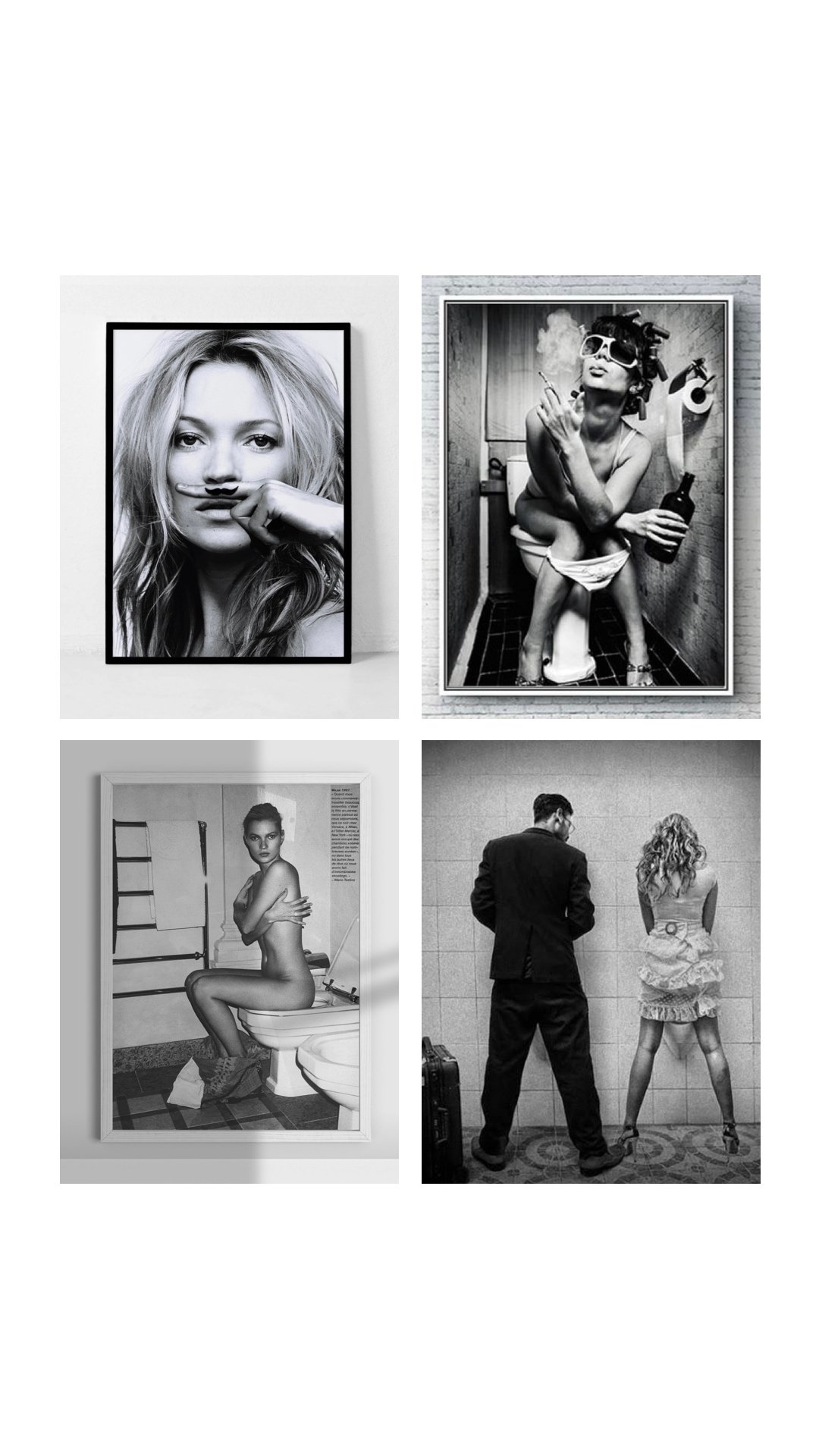
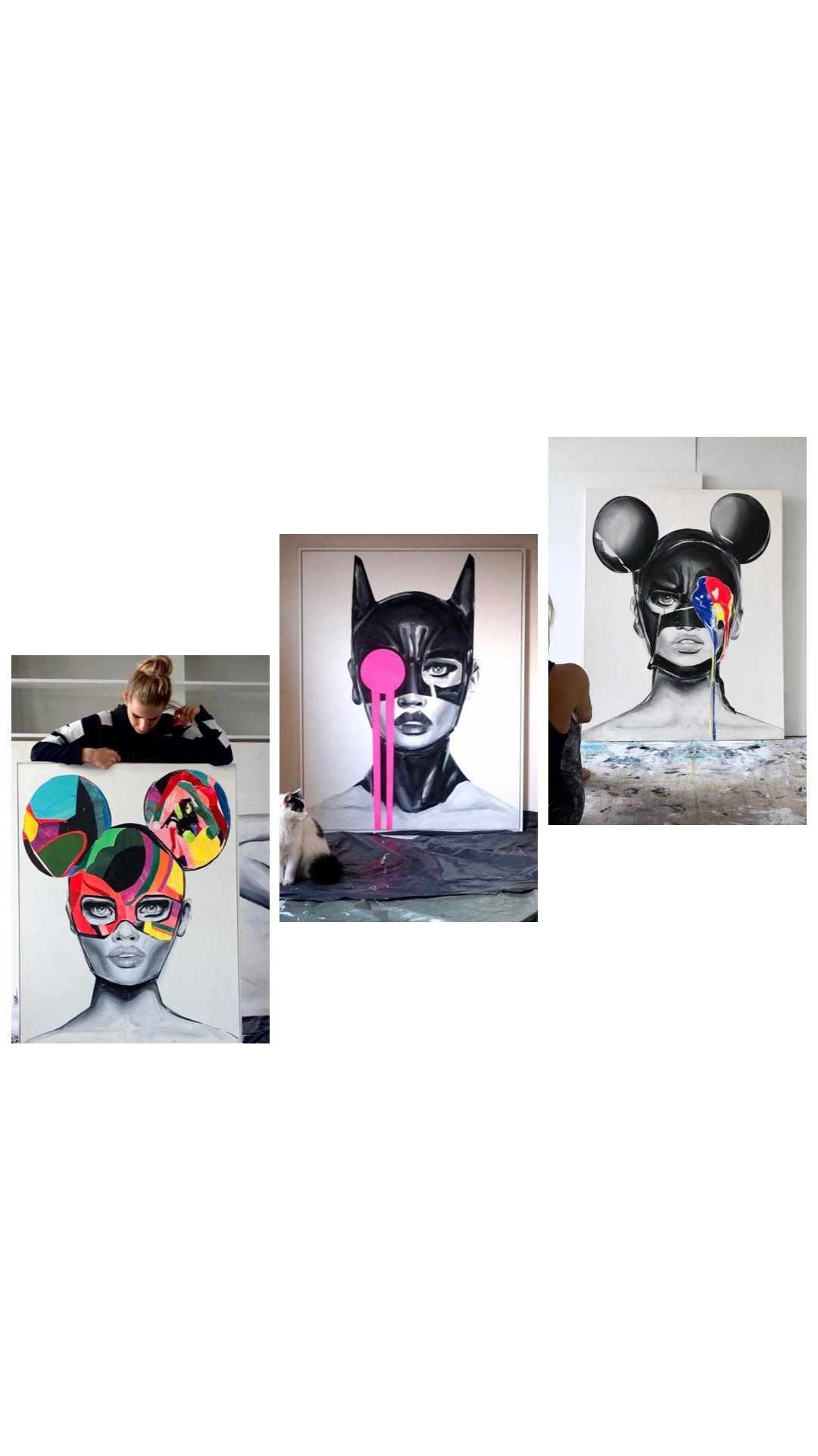
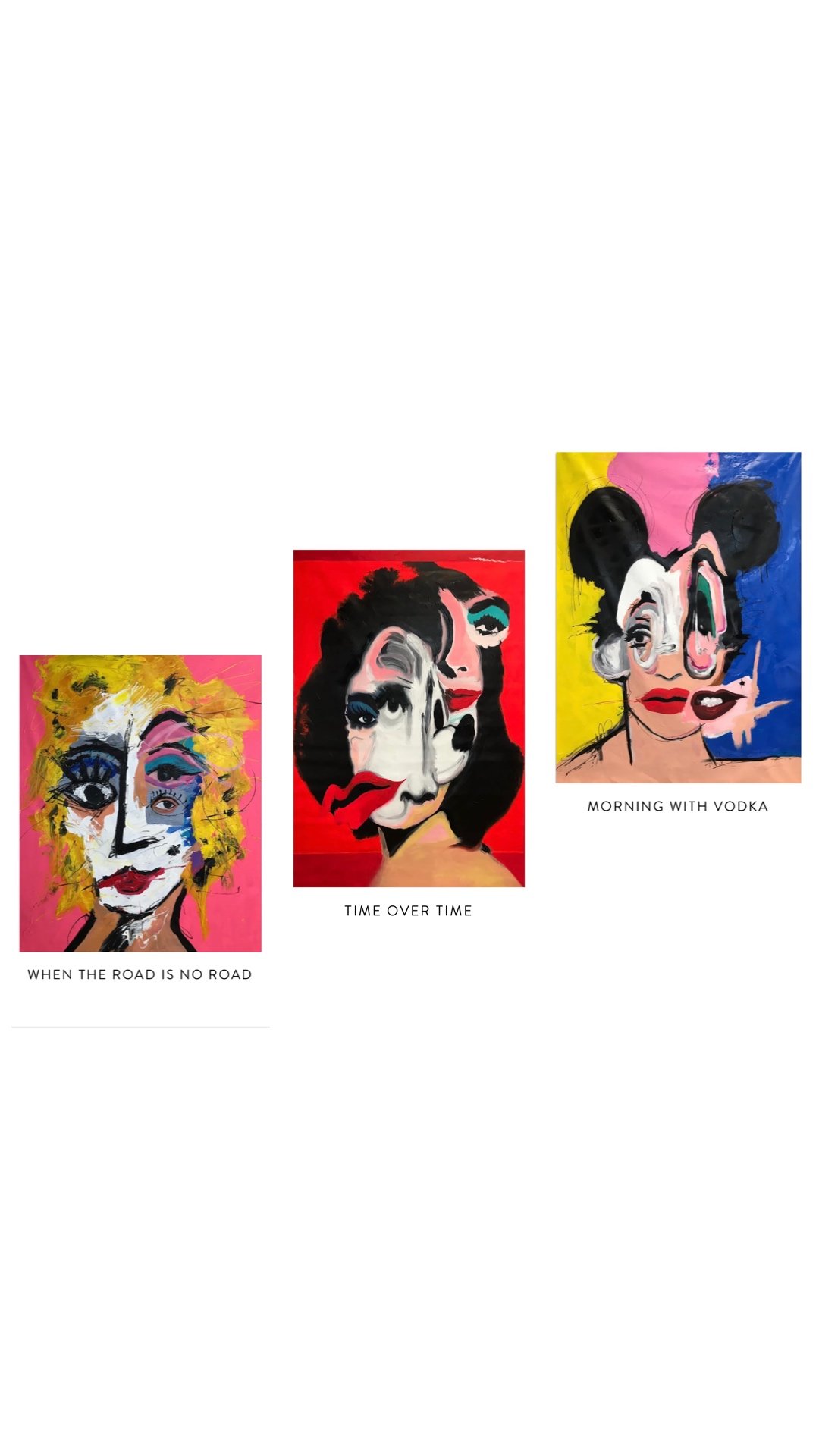
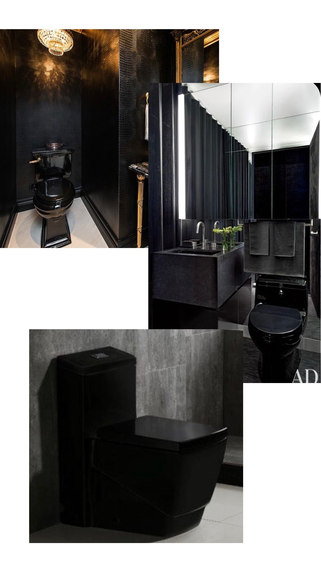
After going to ART BASEL a few years ago I was so inspired by the galleries, art exhibits and the W Hotel in South beach that I knew I wanted this bathroom to be a conversation piece. After all it would be used by guests and I wanted it to have that dark, masculine vibe with tons of POP ART accessories. I also wanted to make sure that everyone that went into the bathroom to do their deeds, would want to take a selfie after! Above the inspiration I sent to TEAM ARETE!
It was amazing to know that they have an entire team of designers, project managers, and of course all the incredible installers that actually makes your vision come to life!
Now let’s talk about the ‘REAL’ transformation here. Click through this gallery for the BEFORE images of what the powder room looked like. I also have a very fun REEL HERE to gauge your interest even further.
Yep.. this is exactly where we started. This bathroom was blah and oh so boring. We needed to make this a conversationalist selfie bathroom pronto!
Ok… now let’s talk about why you’re really here. The resources. I’ll also have a complete shopping guide for you once you scroll down at the bottom of this post. It’s very crucial that you order your supplies prior to starting your demo. I can’t stress this enough. With current times and all the COVID delays we got all of our fixtures, tiles, wallpaper, plumbing, and window shades selects prior to starting. I also highly recommend ordering 20% over what you would need from the get go. In case you run out of materials that you have a cushion and don’t have to stop the project to wait for your orders to be fulfilled. It can take months! I’m not kidding.
Luckily the entire ARETE team is very well aware of this and can help you when placing orders and sourcing materials.
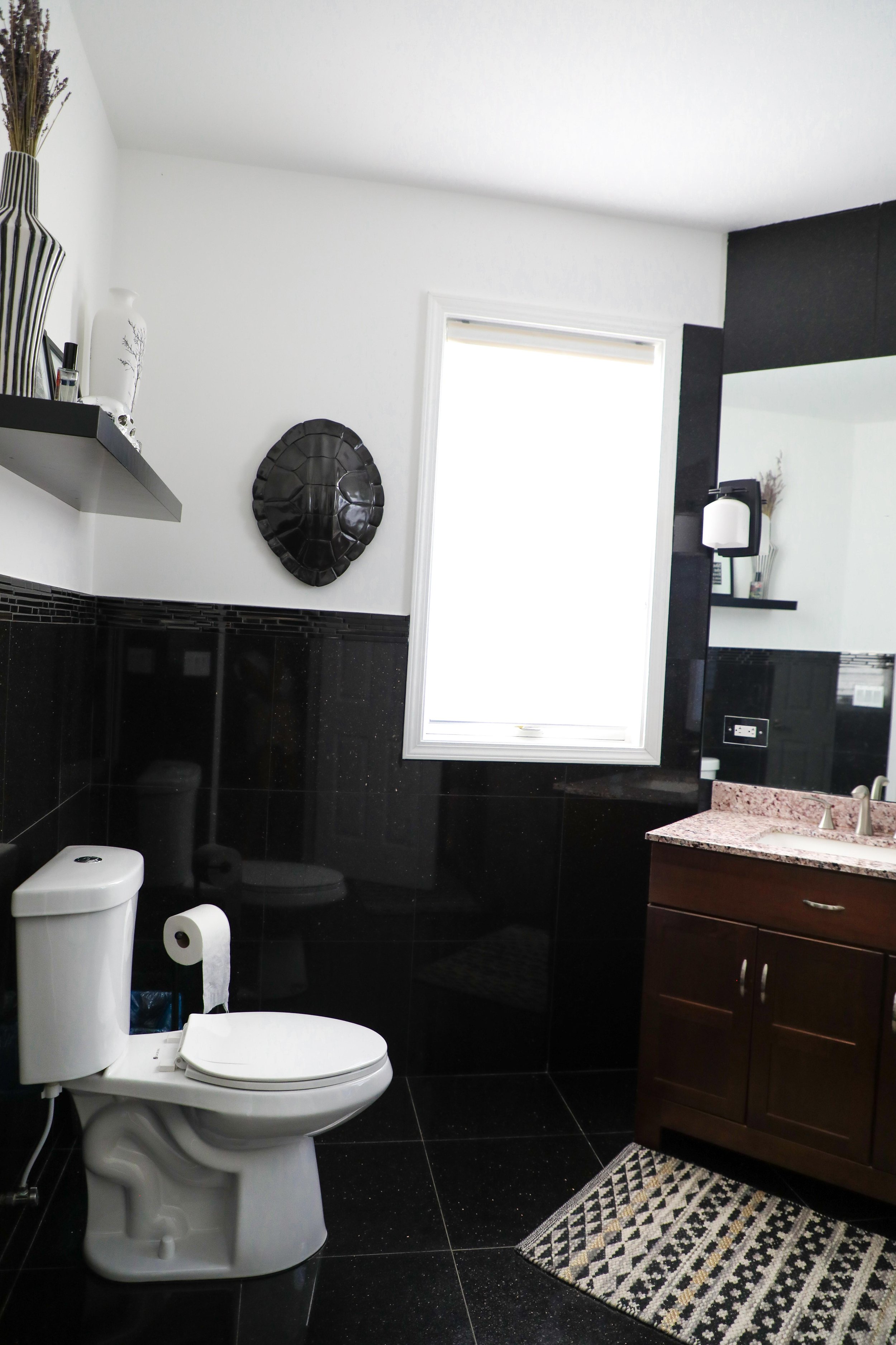
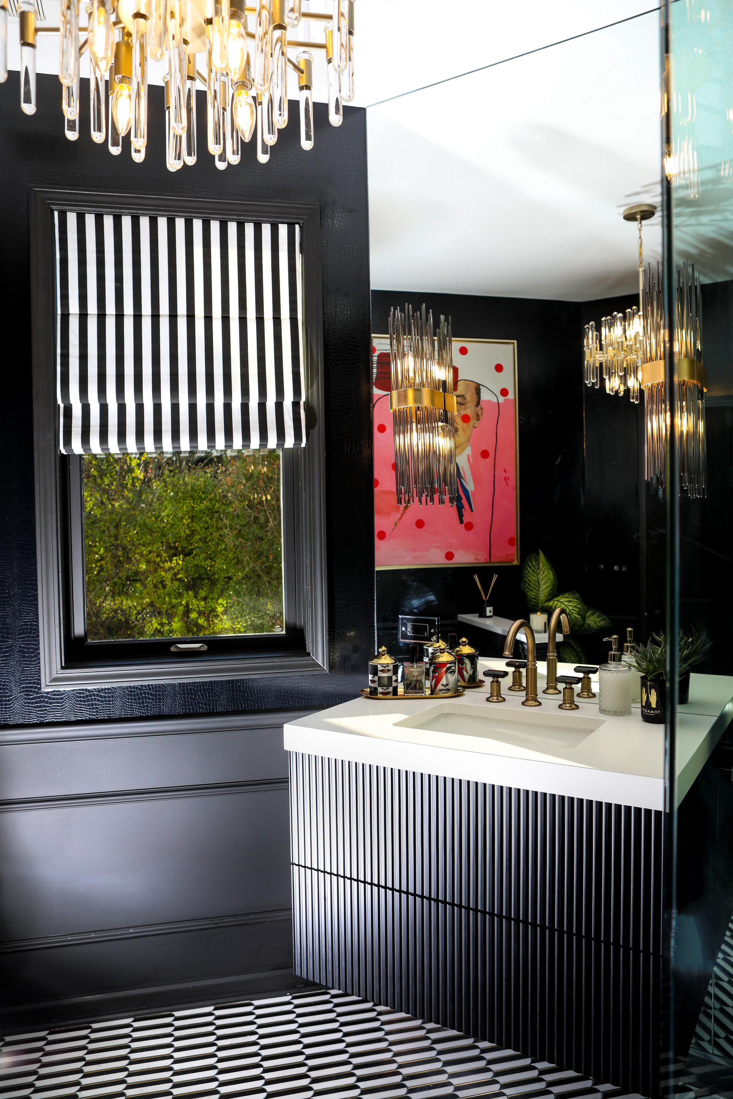
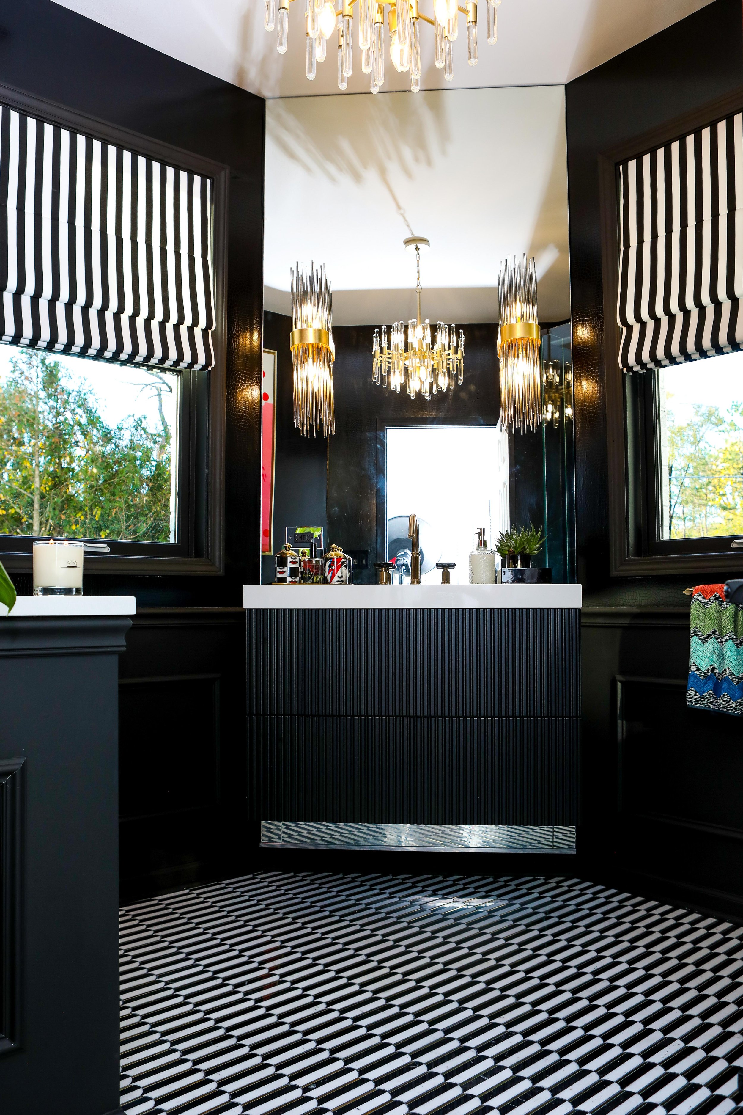
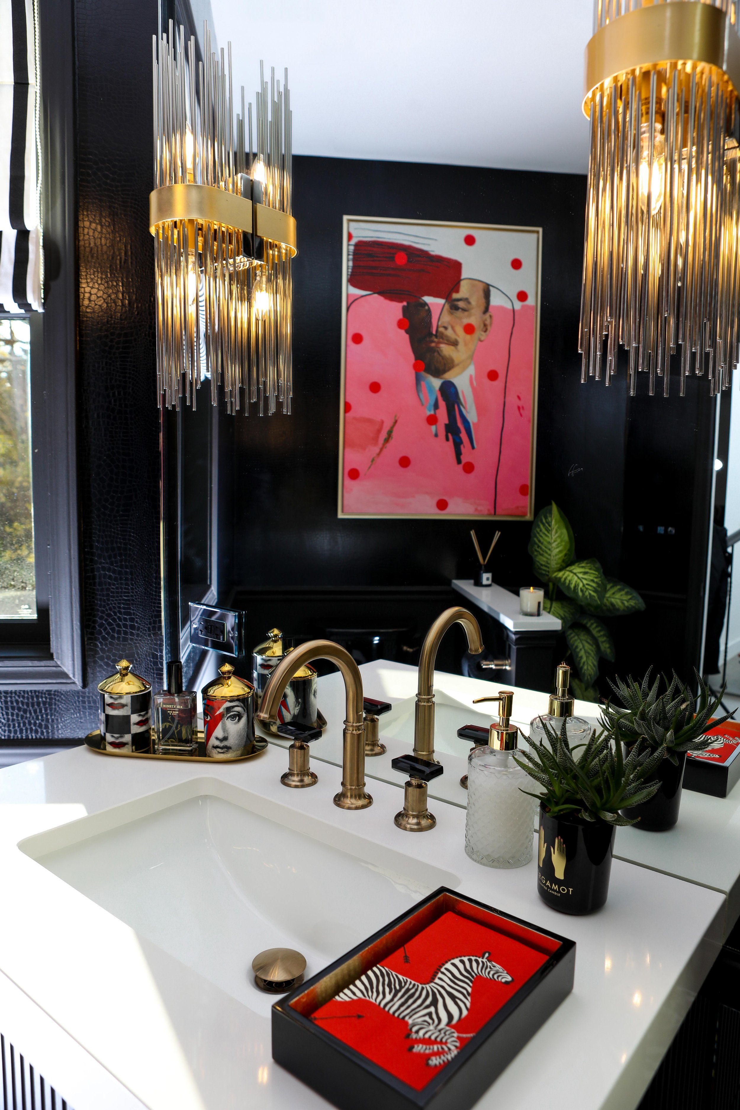
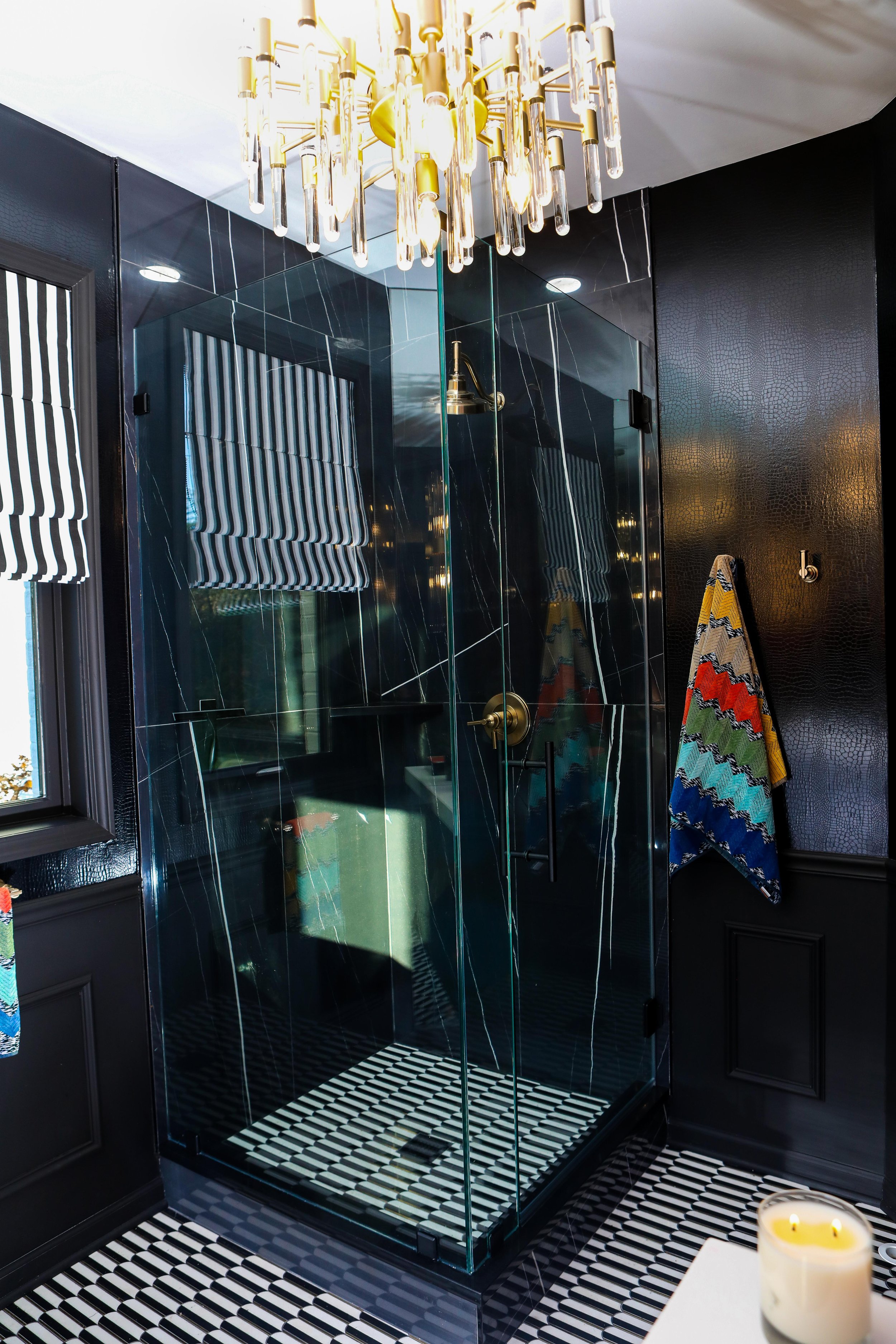
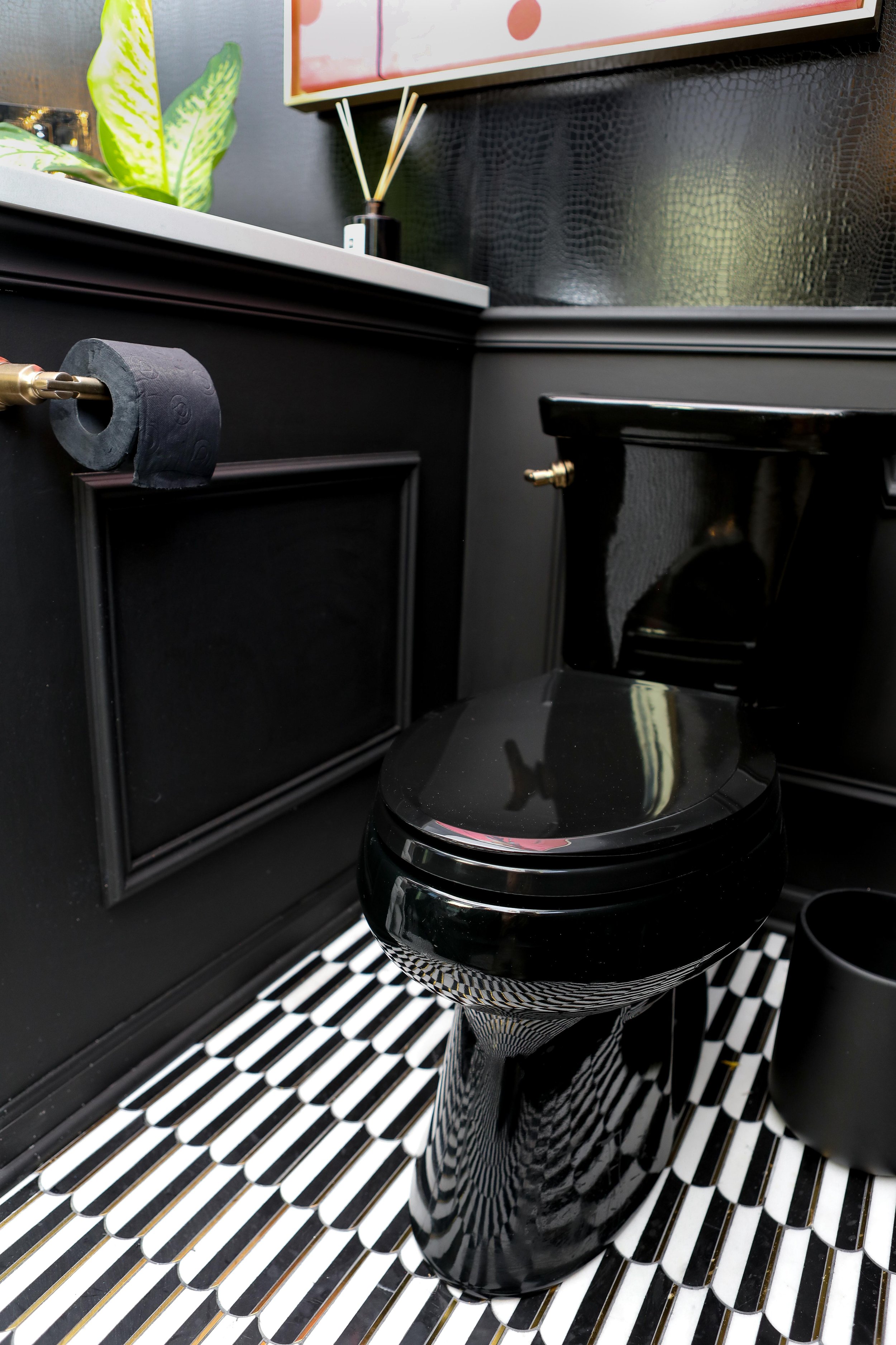
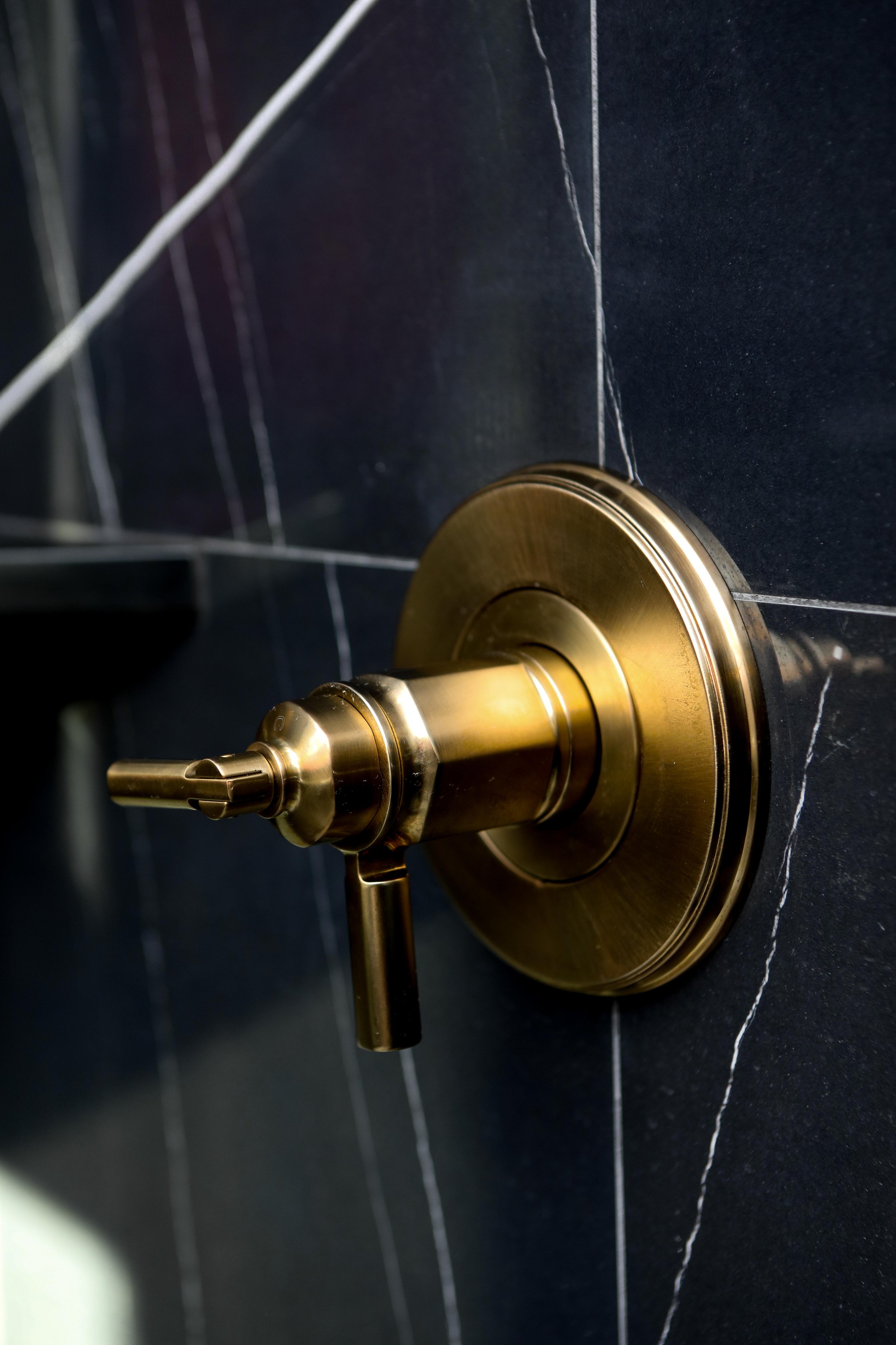
Our beautiful tile came from ROCA. The wall tile is the Sahara Noir Polished 24"x48" and the floor tile is the Oval Nero Marquina and Thassos. I chose black grout for the finish because I wanted it to feel like the vintage floors in so many of my favorite Parisian apartments, restaurants and boutiques. It’s quintessential French!
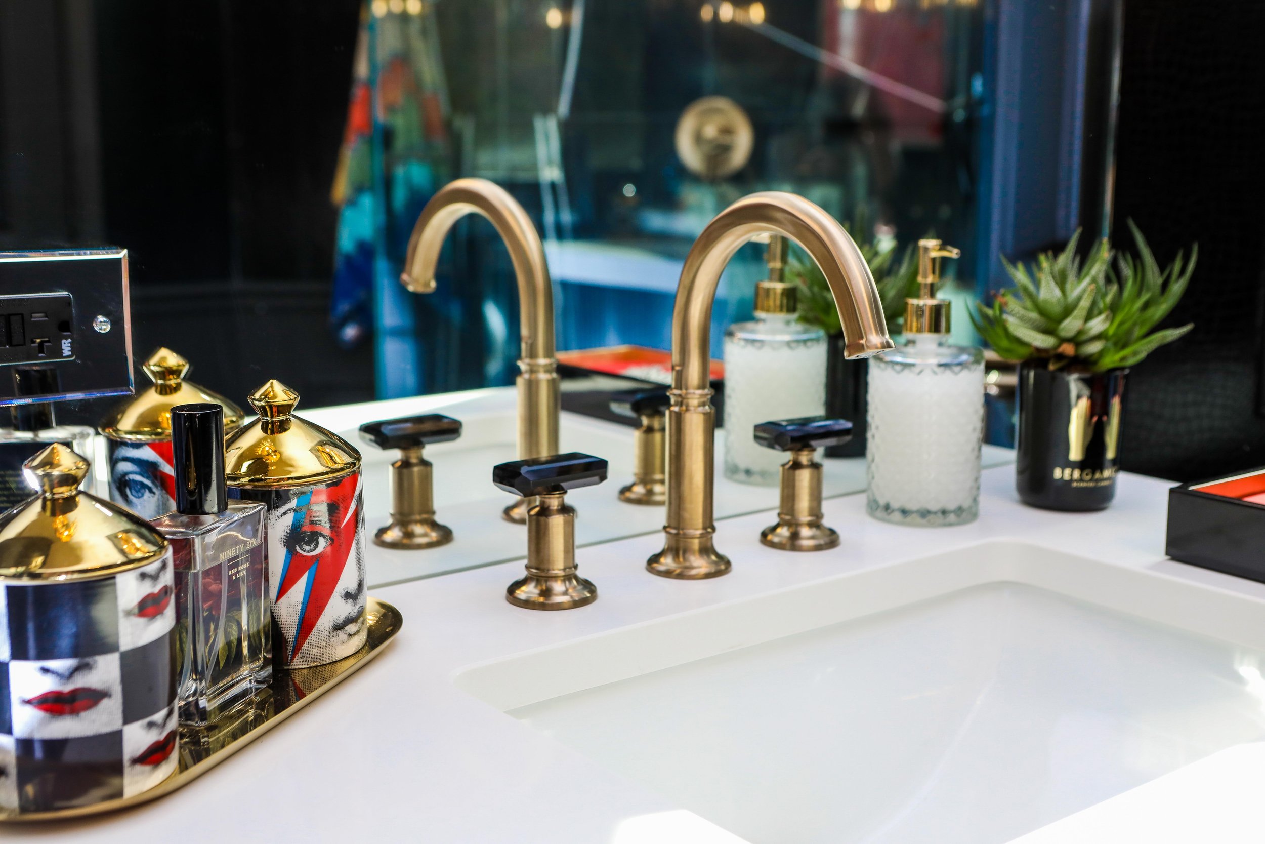
All of our plumbing fixtures and accessories came from Brizo, a brand I’m thoroughly obsessed with. I chose the Invari in Brilliance Luxe Gold line, the faucet reminds me of a Chanel perfume bottle. Again… quintessentially French!
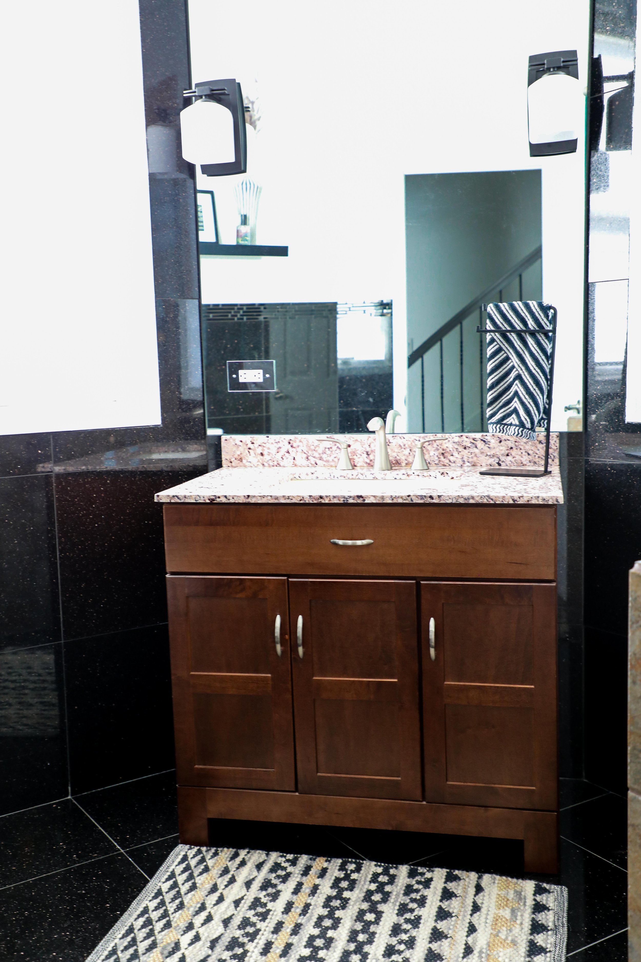
Our vanity literally makes my heart skip a beat every time I see it. I’m obsessed with everything linear and fluted wood. It was custom made by Ervin with E&S Wood Creations, and it’s exactly how I envisioned it!
All of the mirrors and glass came from ANB Custom Glass. Jose is incredible and I’ve shared him on my instagram several times. His company also did the custom smoke glass for my patio dining room table. He is so easy to work with and is truly a master at what he does. I had them cut and create floor to ceiling mirrors so the vanity looked like it was floating out of the mirrored wall.
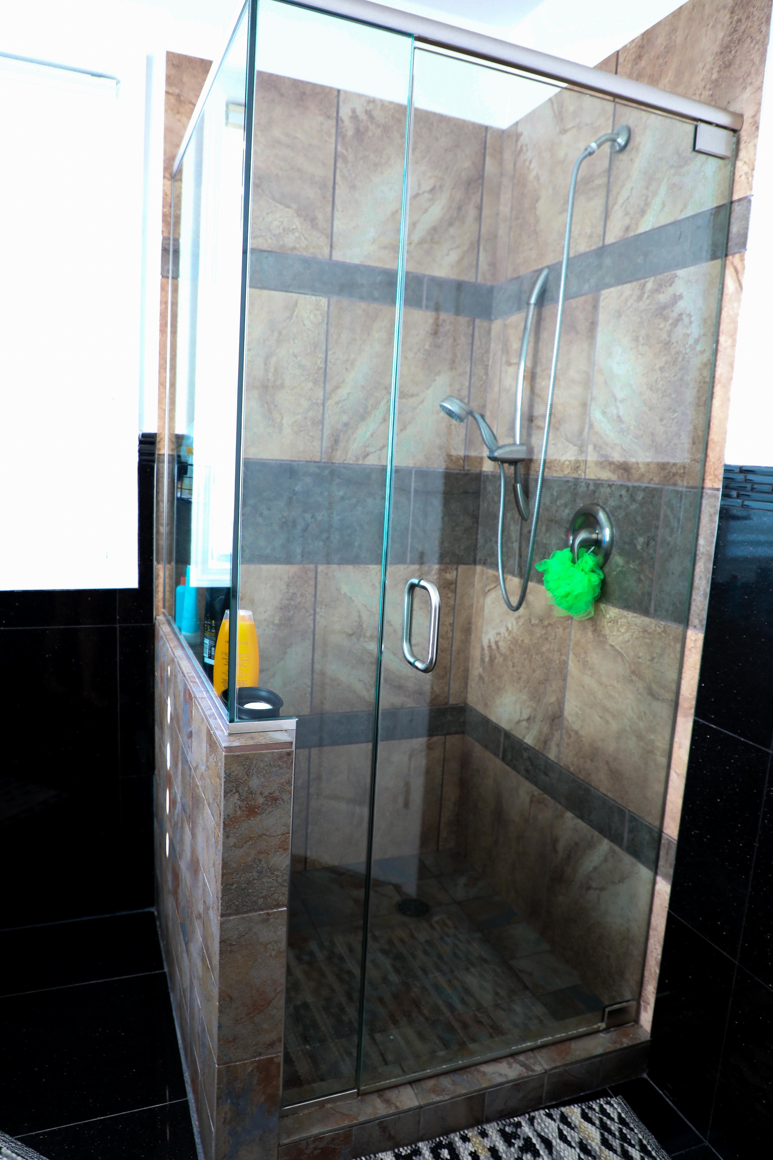
All of my slabs and stone came from Bart at Granite Design. They were extremely knowledgeable and easy to work with. I wanted a vanity slab to feel substantial so we decided to do a 3.5 in miter. I love mitering, makes everything look and feel more substantial. I was originally going to go with a super veiny look, but when I fell in love with the floor tile and veining in the shower it was a bit too much, even for a mix master like me!
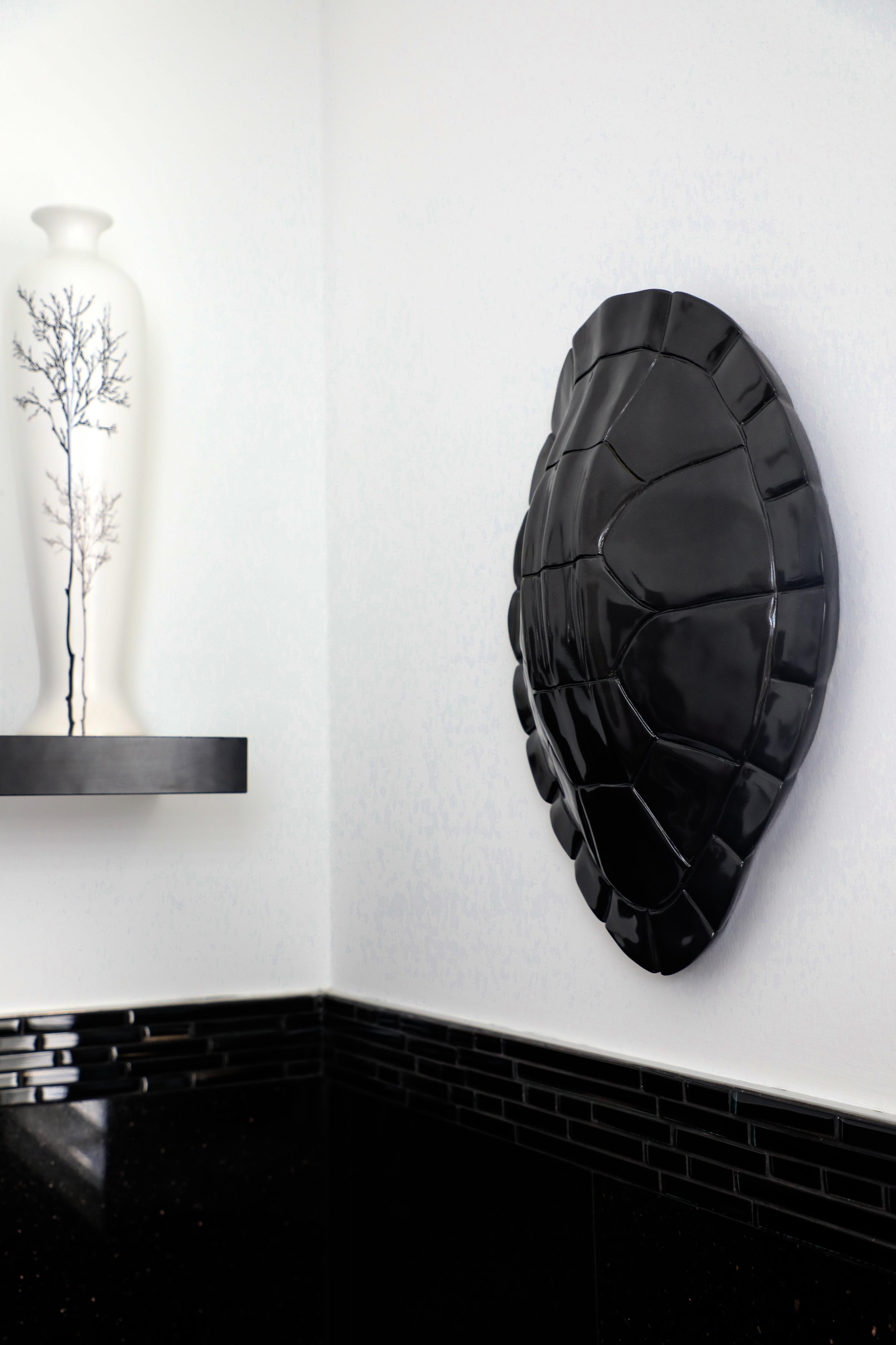
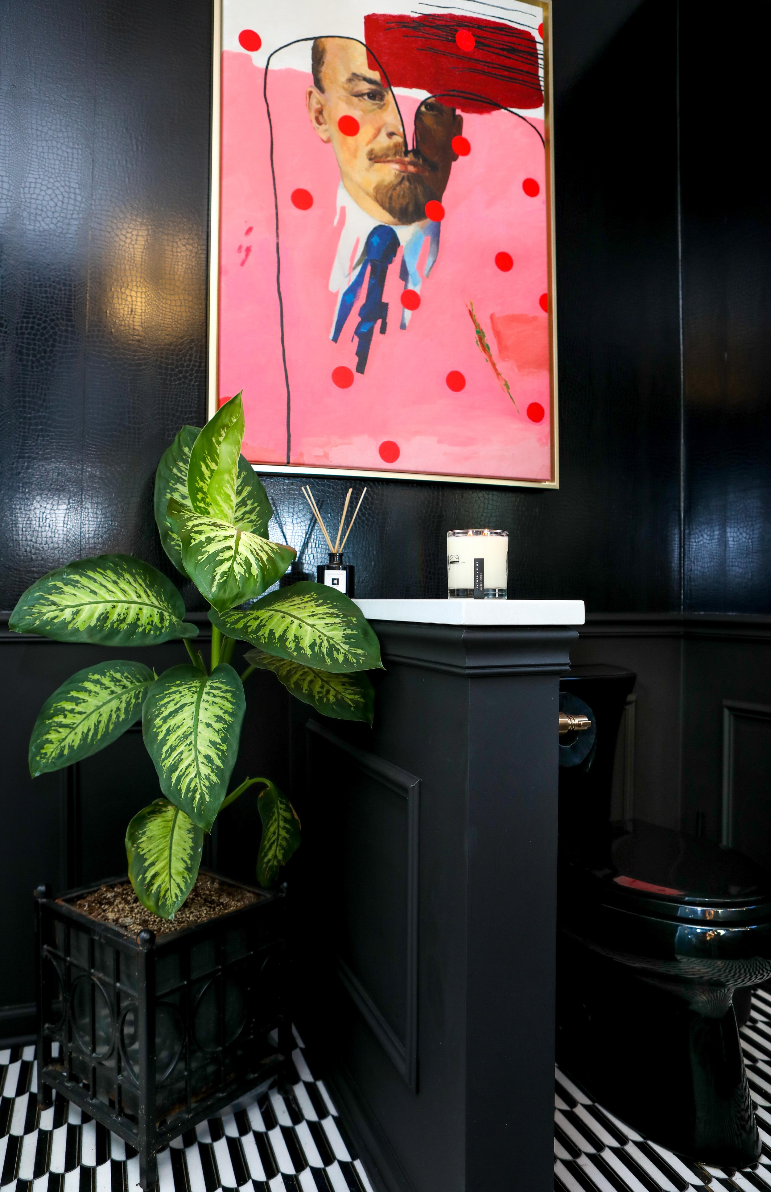
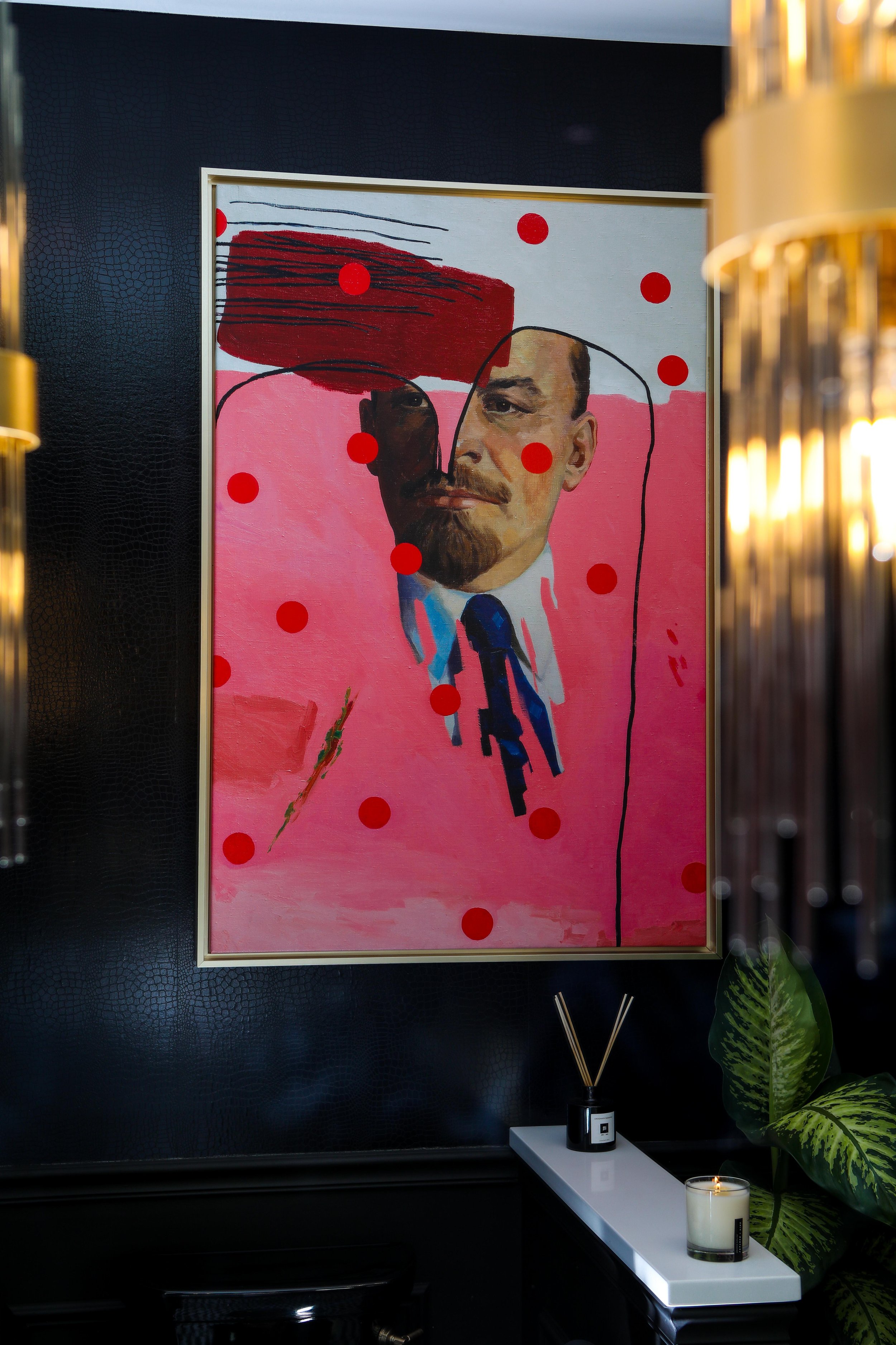
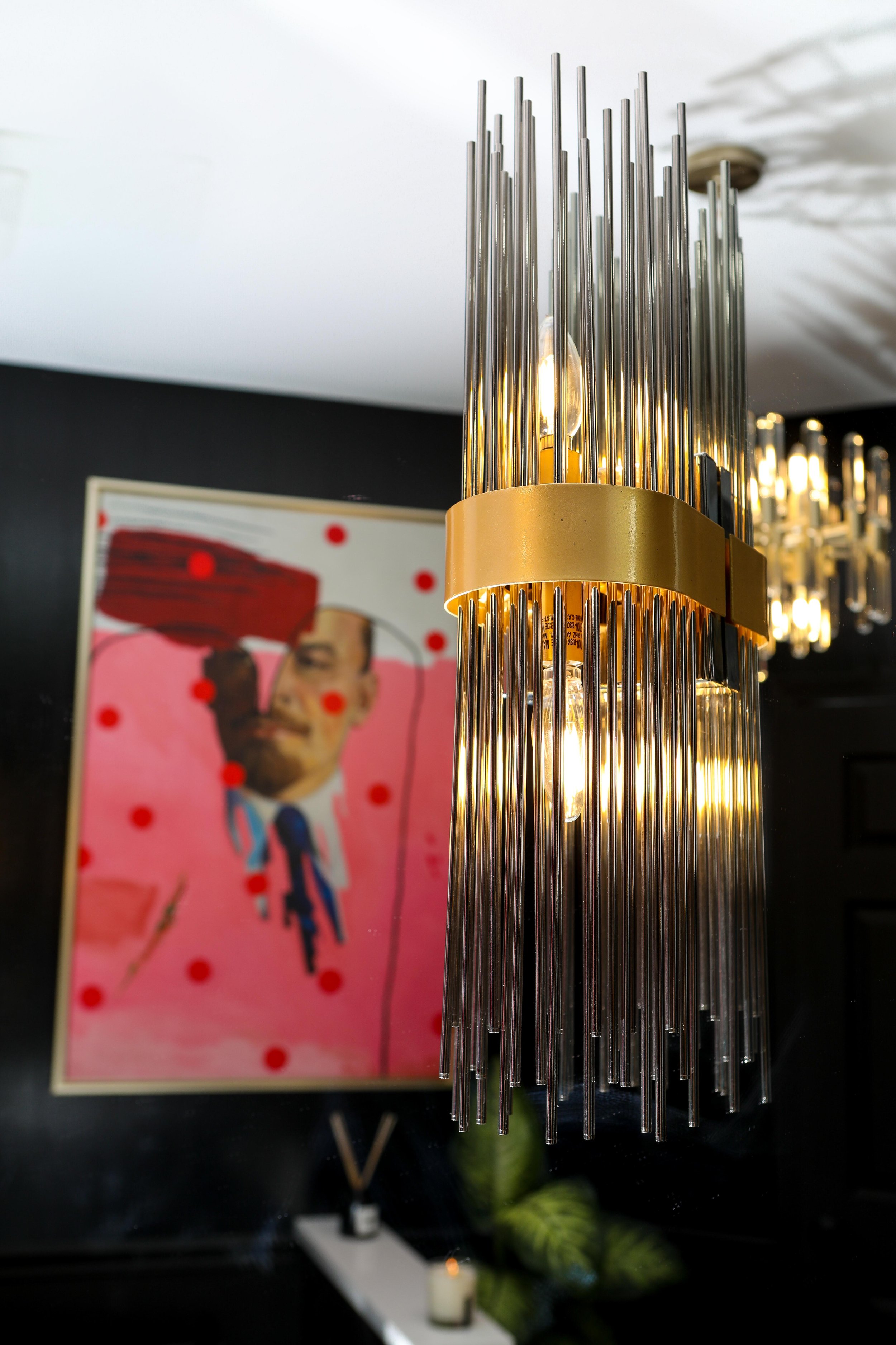
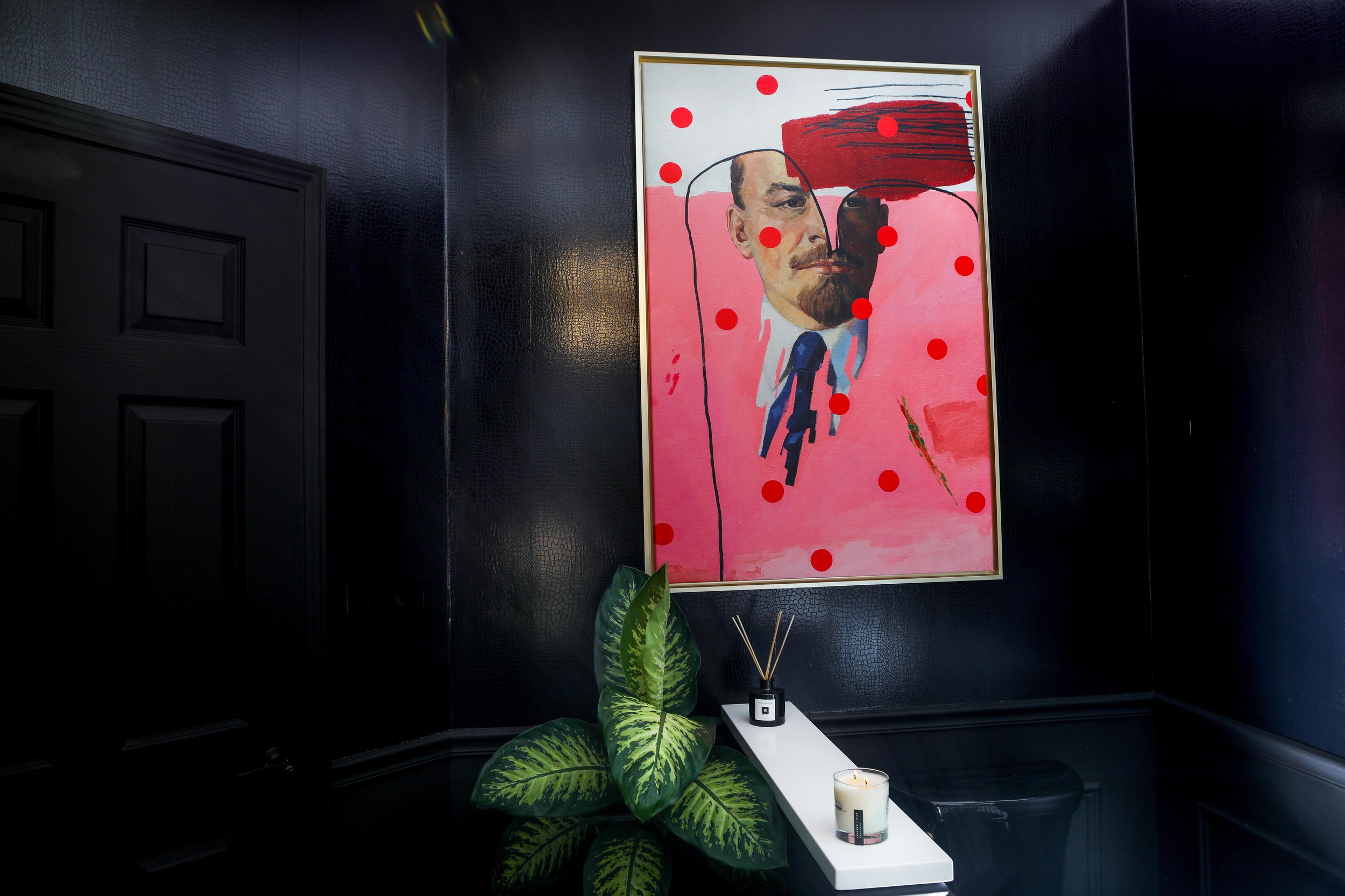
Ok so now let’s talk about art. Probably one of the most important polishing touches in the entire process if you ask me. I knew I wanted pop or modern art as I’m a huge fan and lover of. Also because there was already so much black and white in the room I nixed the B&W photography idea. I knew I needed pops of color and lots of it! I went back and forth between several artists and fell in LOVE with Oleksandr Balbyshev, particularly his Metamorphoses of Lenin series. Now… I got a ton of slack on instagram for putting an image of Lenin in my house. However, controversial art is exactly the type of imagery I’m drawn to. I actually got my degrees in art and art history. I have been studying art and art culture for 25 years. Before my career started I’ve always wanted to be ‘Charlotte’ and become a gallery curator, until my life took me in a completely different direction.
Balbyshev’s Metamorphosis of Lenin actually allows the viewer to overcome the traumatic historical experience of what Lenin actually stood for by transforming the sinister shards of USSR into something funny and not scary. I grew up in USSR, I grew up in communism and whether you like it or not, Lenin is a big part of who I am. It’s the exact conversation piece I’d like in my home, to start that discussion to talk about why and how. In my own sinister way art is meant to make you feel something and that’s exactly why I chose the piece I did for my bathroom.
I also would like to add that I found this piece via iCanvas. It’s an incredible website started by a local Chicagoan that even houses some unique one of a kind pieces from artists just on the site.
Team ARETE and I completed this project in October 2021, and on December 10th, 2021, AD came out with the article all about the comeback of THE MOODY BLACK BATHROOM. I love a moody room, I’m not afraid of darks and I find it to be very sexy. Again, inspired by so many dark moody locations like COSTES, GUY SAVOY and LE CINQ… very Parisian indeed!
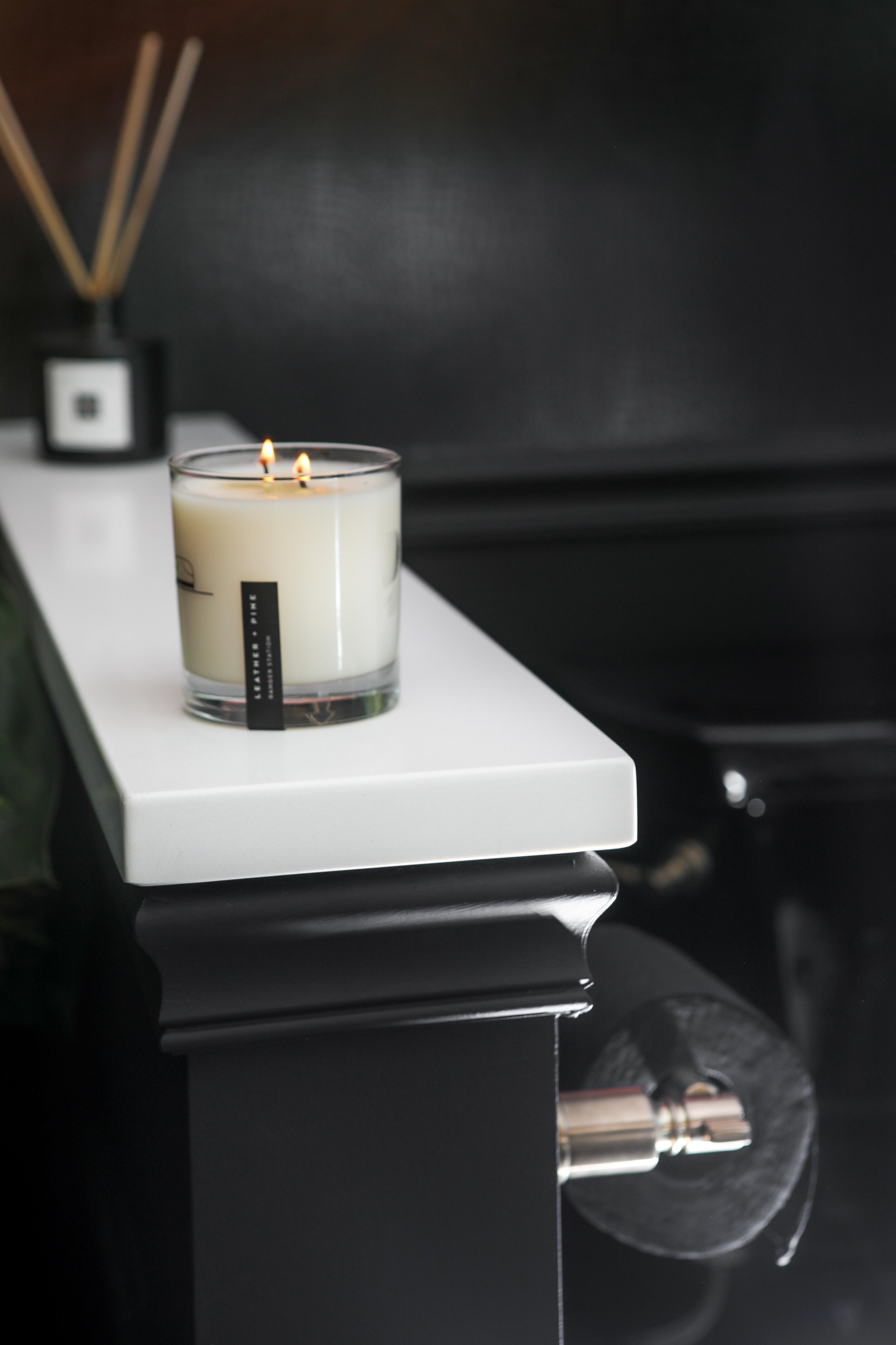
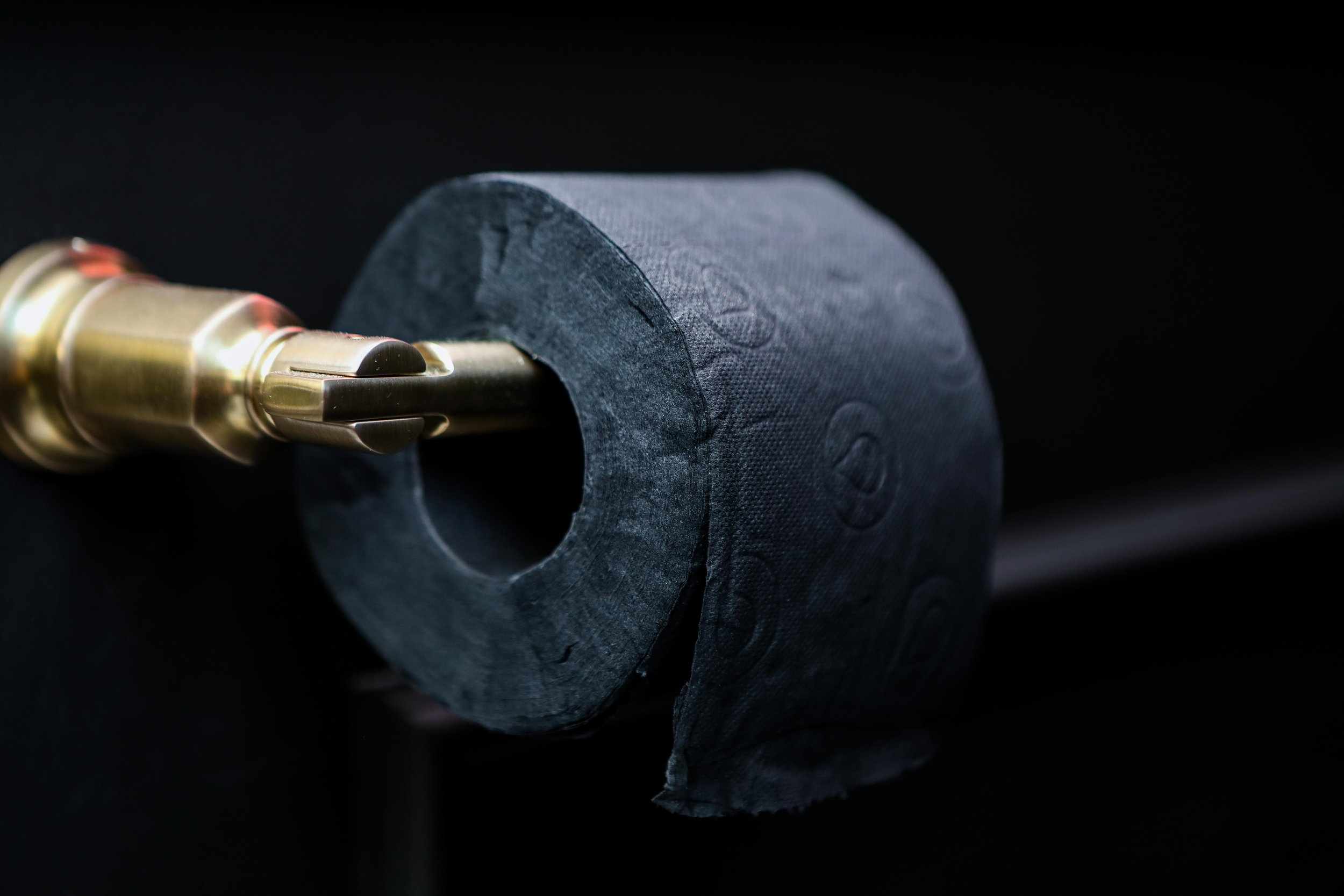
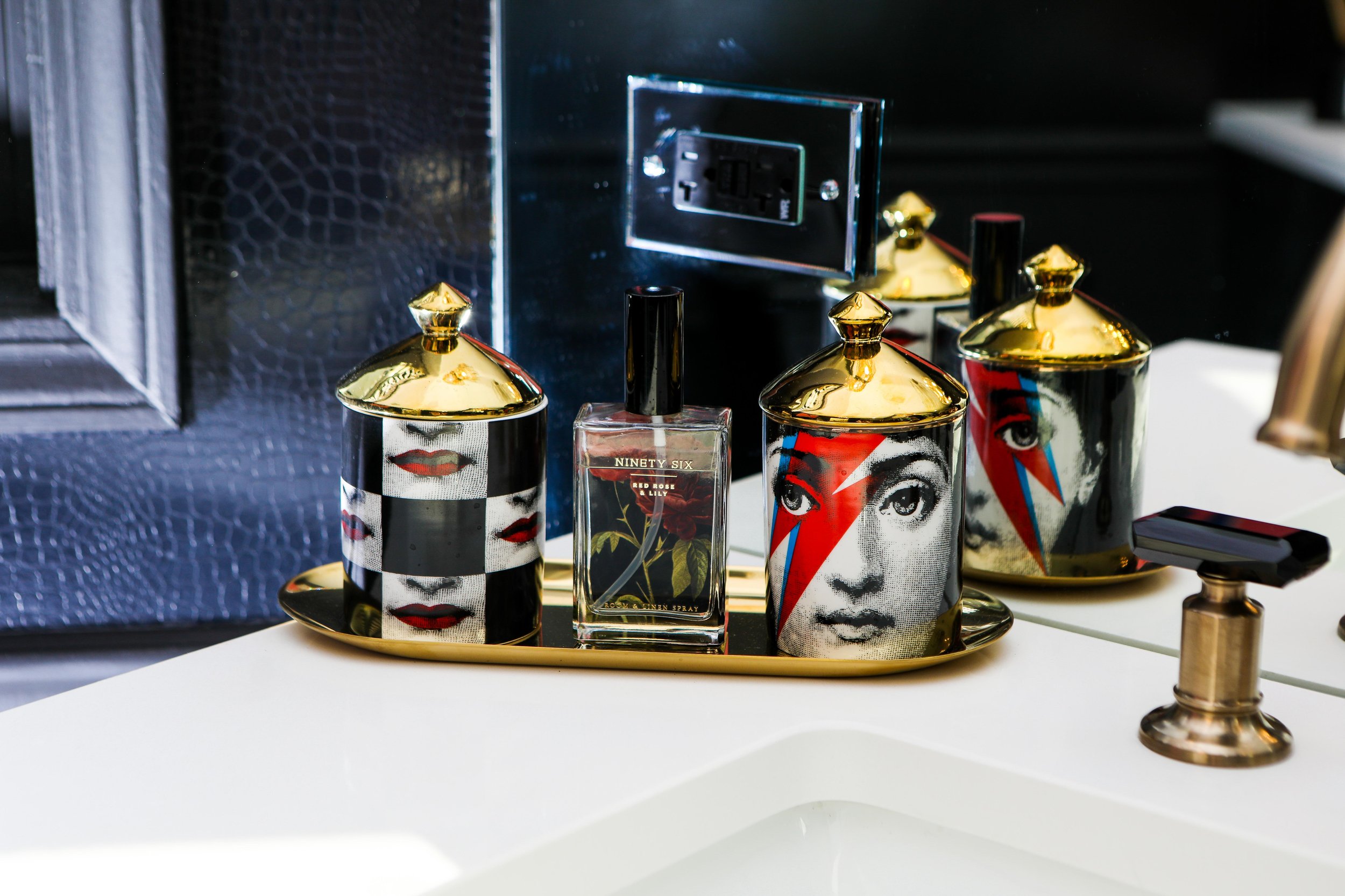
Check out below for links to all of our other accessories in the bathroom… yes black toilet paper included!

